 Let’s go back to basics and discuss the importance of color schemes because I realized, after stumbling upon a hideous blog, that there are still people out there who are totally clueless about which colors are readable and pleasing to the eye, or are maybe just plain colorblind.
Anyway, when choosing color schemes a couple of things you should consider include usability and feel.
Basic usability – This includes readability and contrast between clickable elements and static ones. You should use colors that will contrast enough yet not have the contrast be too glaring so that reading your blog posts won’t be too hard on the eye. You should also make sure that there is enough contrast between clickable elements (links/buttons) so that people will know that they are not just regular text. Of course the easiest and most common way to do this is by using a different color.
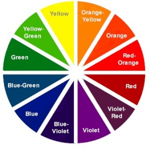
The feel – Make sure you use colors that reflect the way you want your blog to feel like. Remember the atmosphere of a blog reinforces the value of the content. You don’t want a disconnect between your blog’s content and the way it looks. For a warmer feel choose yellows and reds. For a cooler feel choose blues and greens.
You can use online tools such as the one found in ColorSchemeDesigner.com. I like playing around with their color scheme designer tool. There you play around with monochromatic schemes by just changing the hues or choose color schemes according to complement, triad, tetrad, analogic, and accented logic.
Originally posted on February 3, 2011 @ 1:23 pm